


★★★★★
The sunflower texture really pops
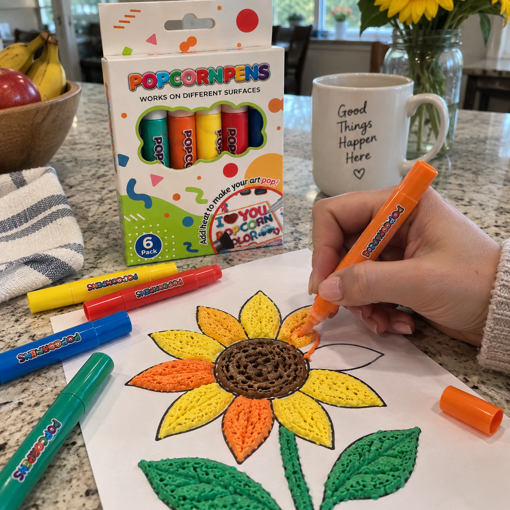
I used the orange and yellow pens on a simple sunflower outline. The raised dots and ridges are easy to feel after they set, and the finished page looks much more dimensional than regular marker coloring.
Couldn't load pickup availability


Turn flat drawings into raised, textured creations. Add dimensional petals, colorful outlines and tactile details to your next art project.

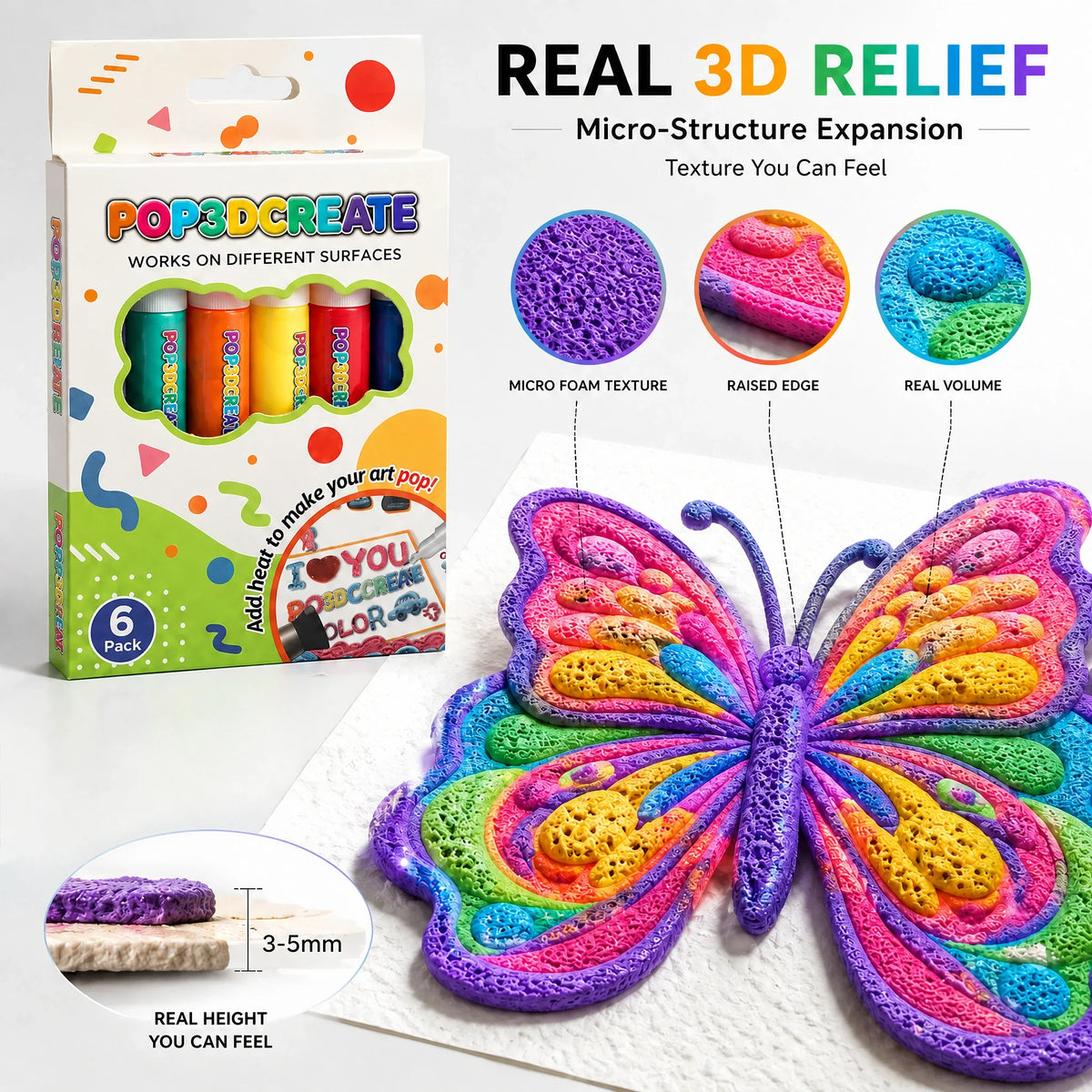
Breaking free from the limitations of flat color expression, the Vandelle Home 3D Relief Art Pen utilizes layering and dimensional shaping to transform ordinary lines into forms with tangible height, rich texture, and natural interplay of light and shadow.

Your favorite paintings are no longer just images.
With every stroke, colors transform into:
🌻 Realistic 3D textures
🎨 Raised paint layers
✨ Museum-style embossed artwork
Draw. Create. Experience Art Like Never Before.

Create stunning 3D textured wall art with your own hands.
Transform simple materials into beautiful raised decorations that bring color, depth, and personality to any space.
✨ 3D Raised Texture
✨ Handmade Wall Decoration
✨ Unique Home Artwork

A new generation of creative material technology—designed to elevate every line, every color, and every idea into true 3D expression.MAKE EVERY CREATION A PROFESSIONAL RELIEF ARTWORK
 Endless Ways To Create & Decorate
👜 Hanging Ornaments
Add a personal touch to bags, keys, backpacks, and more.
🍍 Cute Squishy Creations
Make adorable characters with fun textures and playful designs.
🎨 3D Decorative Artworks
Transform simple ideas into colorful raised masterpieces.
🖼️ Decorative Paintings
Create handmade wall art that brings warmth to any space.

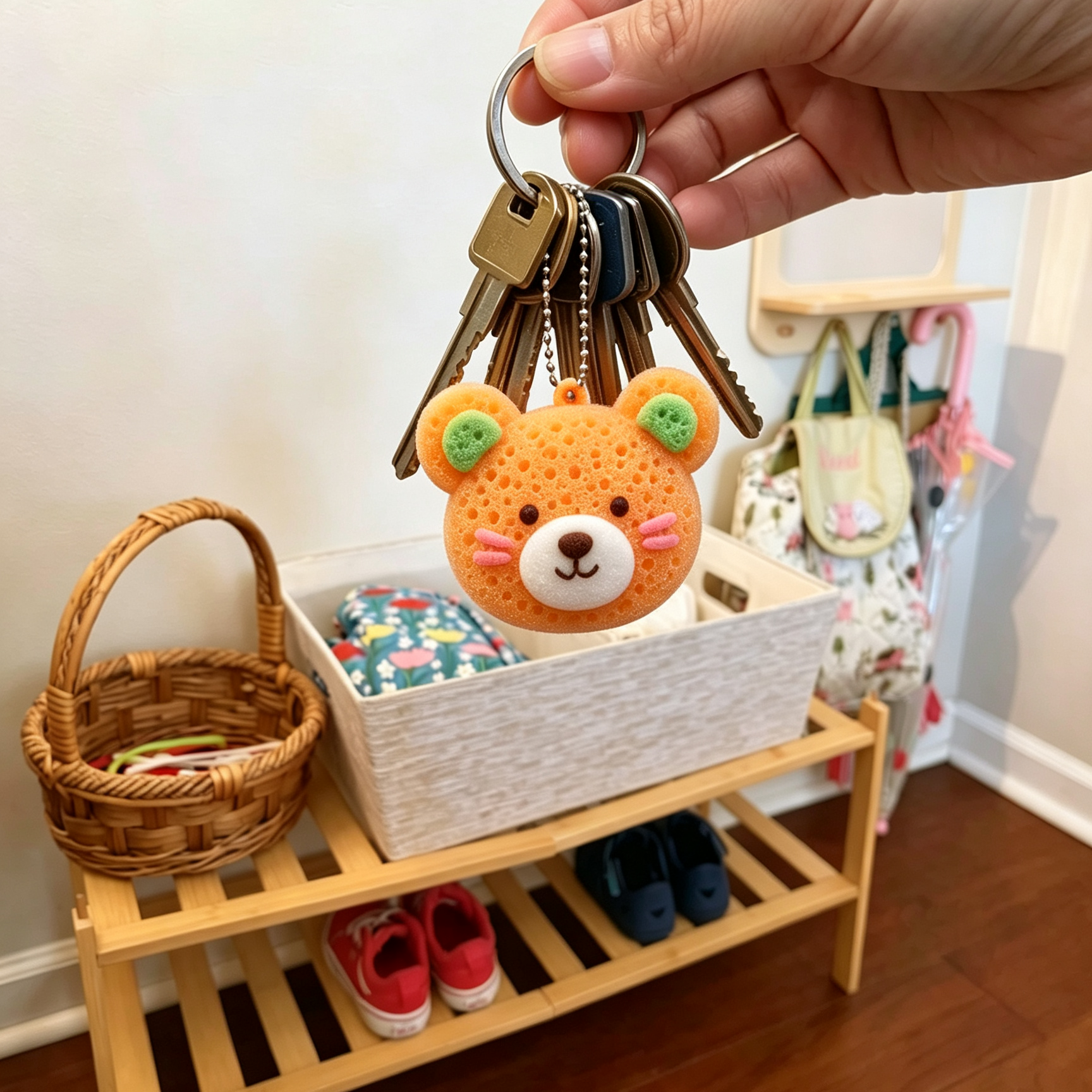
Try colorful raised details on a handmade charm.

Build up swirls, stars and textured strokes in your own interpretation.

Explore layered shapes and dimensional details for a decorative art piece.


CUSTOMER REVIEWS
I used the orange and yellow pens on a simple sunflower outline. The raised dots and ridges are easy to feel after they set, and the finished page looks much more dimensional than regular marker coloring.
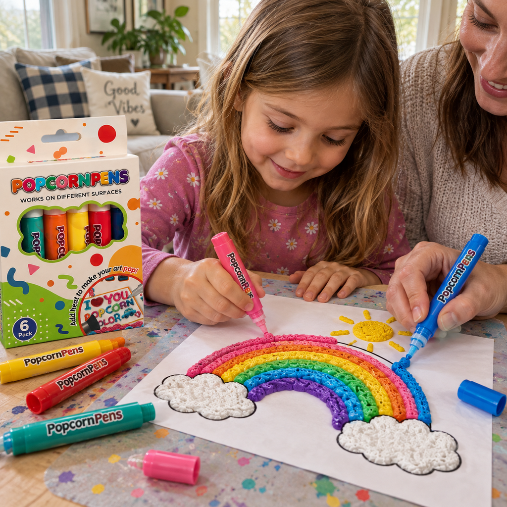
My daughter used the pink and blue pens for a rainbow while I helped with the clouds. The chunky applicators were easy for her to hold, and seeing each line puff into a raised texture kept her interested.
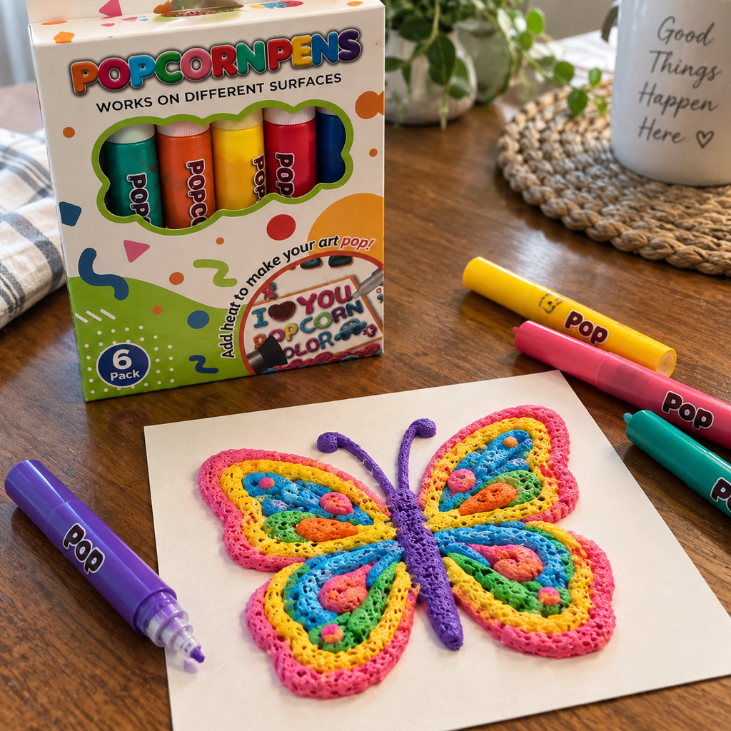
I layered the purple, pink and yellow colors on a small butterfly. The texture hid a few shaky lines and gave the wings a cheerful handmade look without needing a complicated tool.
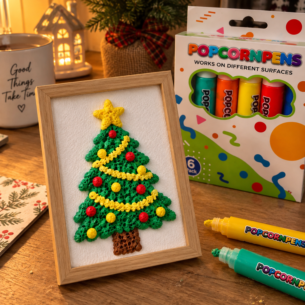
The green pen made a raised Christmas tree and the other colors worked well for tiny ornaments. Once framed, it looked like a small textured craft instead of a flat coloring page.
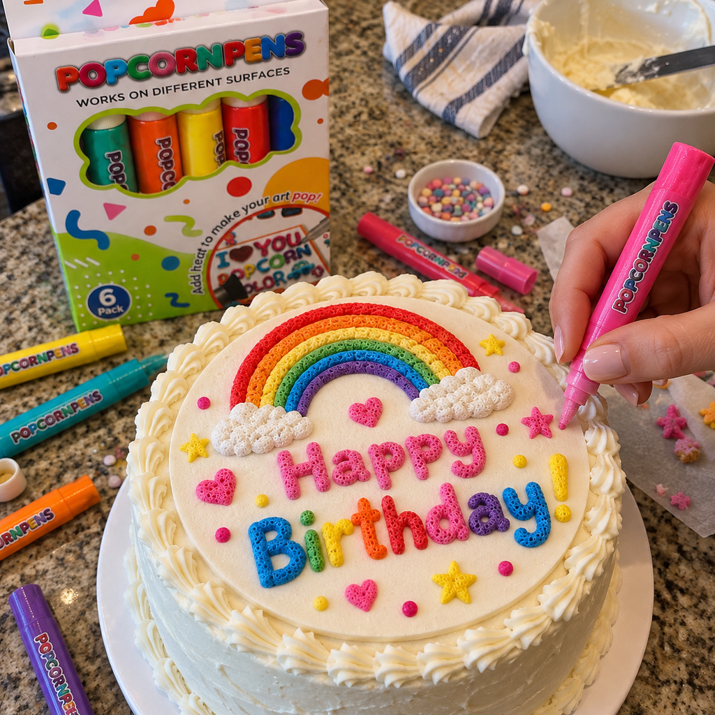
I added raised stars and dots to a simple birthday topper. The pens let me place small accents exactly where I wanted, and the puffy finish photographed nicely next to the cake.
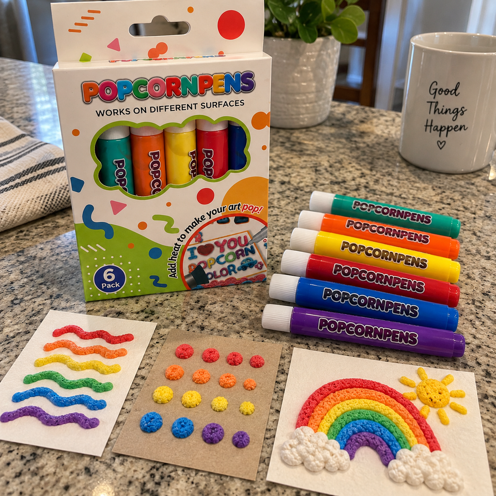
I tested thin lines, dots and a thicker patch on cardstock. The difference in height is obvious from the side, which helped me decide how much pressure to use before starting a larger picture.
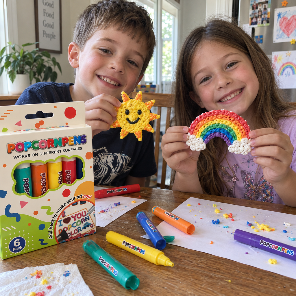
We made a rainbow and a smiling sun during one afternoon craft session. The results were not perfectly even, but the bumpy texture is what made the pieces feel playful and worth keeping.
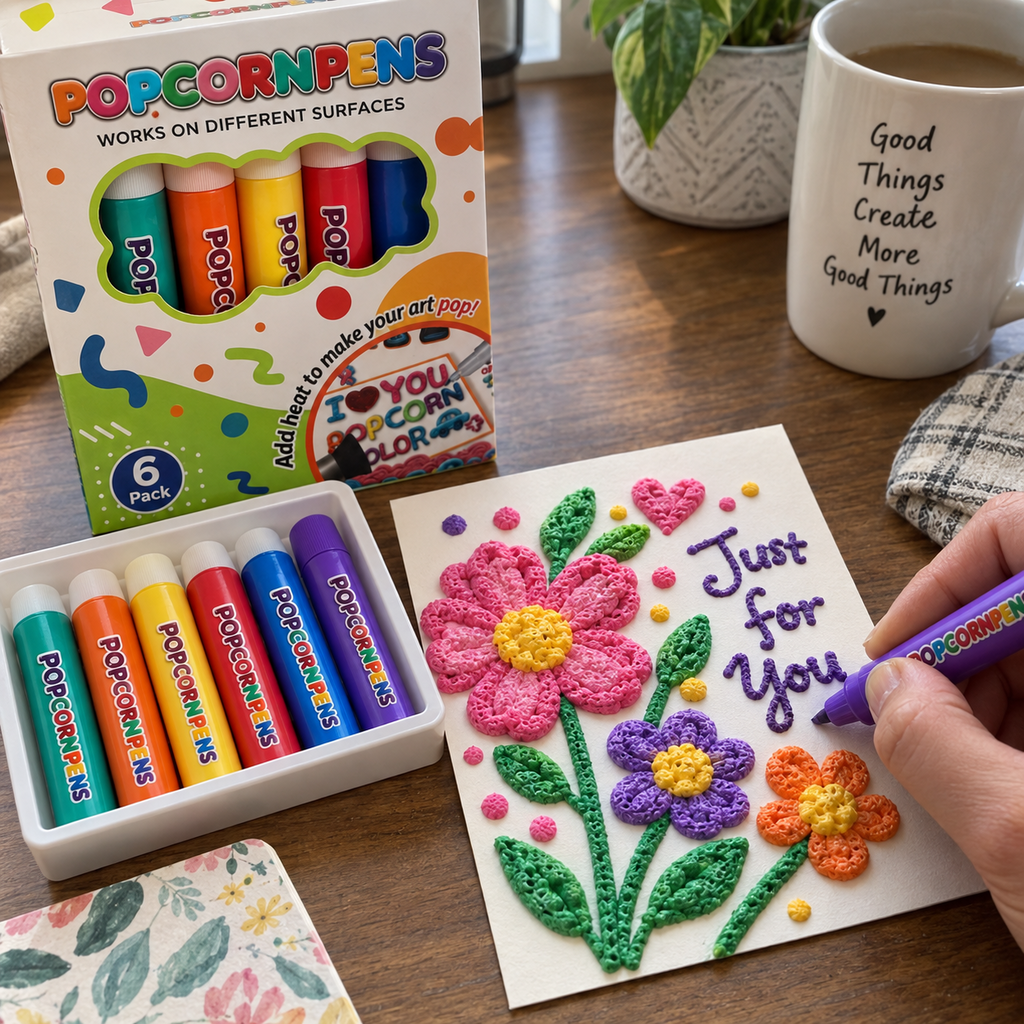
I used the purple and pink pens for flower petals on a handmade card. The raised centers and outlines added enough depth that the card felt special without covering the whole surface.
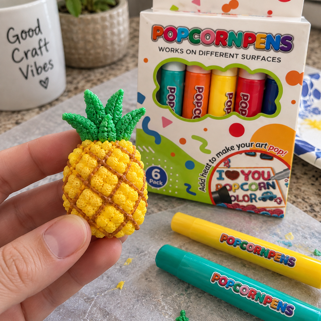
I built up short yellow strokes for a tiny pineapple and green strokes for the leaves. The finished piece has a soft-looking, pebbled surface that makes a simple shape feel more interesting.
The six colors gave me plenty to test, and the sample dots showed a nice raised effect. My first lines were thicker than planned, so I recommend practicing pressure and spacing before working on the final drawing.
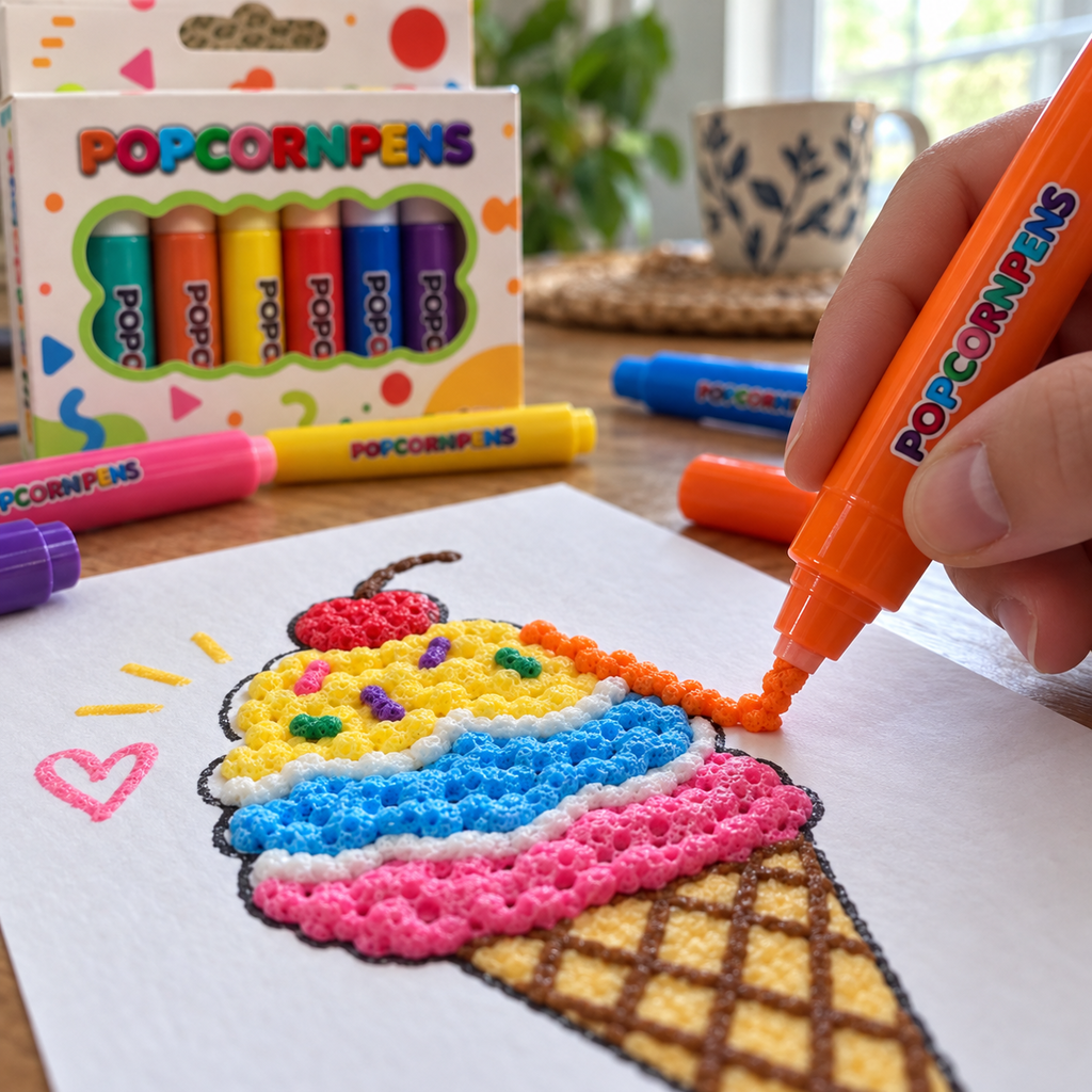
A basic ice-cream drawing became much more fun once I added raised swirls and sprinkles. The pens are best when I work slowly and let the texture be part of the design.
I used short taps instead of long lines for a field of flowers. The dots stayed distinct and created a textured center that regular paint markers never give me.
The adults outlined the design and the kids filled sections with raised color. Everyone could contribute without needing a screen, and the final piece clearly shows who chose each color.
I layered blue and green on a small ocean scene. The lines cast tiny shadows in daylight, so even a simple wave pattern looks dimensional when viewed from an angle.
I decorated kraft-paper gift tags with raised initials and small stars. The texture makes them stand out on a package, and I only needed a few short strokes per tag.
My niece usually rushes through coloring pages, but she slowed down to control the raised lines. The tactile result made the activity feel new even though the drawing itself was simple.
The colors and raised finish look great on my floral card. It took a few attempts to keep the line thickness consistent, but a practice sheet solved most of that.
I drew a small tree on cardstock, added raised lights and cut it into an ornament. The uneven handmade texture actually suits the project and makes it feel personal.
I got the most dimension by letting one set of lines settle before adding another color. The layered petals on my flower have more depth than a single heavy pass.
I would not fill a whole canvas with these, but they are excellent for highlights, borders and focal details. A few raised sun rays changed the look of my landscape drawing.
The short marker shape feels familiar, so I could concentrate on the design rather than learning a machine. A steady squeeze produced clean dots and short textured strokes.
We kept the pens and paper on a washable mat and had a low-mess afternoon project. The raised rainbow was ready to display once we left it alone to set.
I added textured flowers around the edge of a plain craft frame. The colors gave it a cheerful handmade border without needing separate beads or glued decorations.
I made a small card for my craft group and the textured details showed clearly in phone photos. The effect is strongest when light comes from the side.
The set is great for dots and bold outlines. Very small letters were harder to keep crisp because the material expands, so I now use it for larger lettering and decorative accents.
We pulled out a stack of finished pages and added raised borders, petals and stars. The pens gave the artwork a second life without requiring new templates.
Testing each color as a line, dot and thick patch made the final project easier. I knew which texture I wanted before touching the actual picture.
The raised heart and flower details make the card pleasant to touch as well as look at. It feels more personal than printing a design and still fits a simple craft routine.
The colors read clearly on white cardstock and work well for kid-style art. I especially liked combining short strokes and dots instead of trying to make every line perfectly smooth.
This is not just another set of markers. The finished design has visible height and a bumpy surface, which makes even a basic rainbow feel like a small relief piece.
My first test had a few oversized dots, but the next card looked much cleaner. Once I used lighter, steadier pressure, the raised border stayed where I intended.
I created a small flower panel and stood it beside my monitor. The raised colors catch the light and give the piece enough depth to look decorative from across the desk.
I can finish one small motif without setting up paint cups, brushes and glue. The pens are easy to bring out for a quick project when the kids want something creative.
The dimensional look is excellent on my butterfly. A very heavy patch became less neat than the smaller strokes, so I prefer building the texture gradually.
The puffy result is fun and the colors are bright, but the expanding texture softens very fine details. I will keep using the set for bold shapes, dots and kid-friendly projects rather than intricate lettering.